 Invite all your friends to a Halloween gathering with these sweet print-your-own invitations. Print as many as you wish (for your personal use) on your own printer, on the paper you want, and even embellish them to your heart's content!
Invitations are delivered in a digital PDF file that you print. When you purchase this item, a download file will be made available to you IMMEDIATELY after you checkout.
The PDF file prints on 8.5"x11" and has two flat postcard-style 7"W x 5"H invitations on each page you print. Once you've printed, simply cut around the dotted lines, fill out the invitation by hand, and send them out!
Each invitation will fit in a standard A7 envelope.
The Pearly Story Behind "Dusting in Pearls"
I always feel like a walking paradox. I can get out in the garden with my shovel and sledgehammer and love every dusty dirty minute I'm out there. I spend the majority of my life dressed in my "grubbies". Yet there's a part of me deep down inside that still likes "the frillies", "the pearlies", and "the sparklies"--all the pretty things. Maybe it's all the great classic Hollywood movies I watched as a kid. I don't know. All I know is that I can be dirty and sweaty and still want to put on heels when it isn't practical; buy the prettiest apron even if it will get dirty; and don pearls when all I'm going to be doing is dusting and vacuuming the house. It doesn't make sense. It doesn't have to. I've decided to claim it, celebrate it, and have fun with it... and create some "pearly" goodness along the way.
Thursday, October 22, 2009
Print-Your-Own Halloween Invitations
Posted by Cindy Garber Iverson 0 comments
Labels: stationery
Friday, October 16, 2009
Behind the Scenes: Mum Dreams

I love to take macro shots (close-ups) of flowers. Sometimes the shot looks great just as it is, but sometimes I like to tweak it a bit to make it into an art photo. Here's a quick way that I do that.
I open the photo in Photoshop (I use CS3 but this will also work in Elements and other versions). The photo becomes the first layer in the file.
Using the "Place" command (under the "File" menu), I place a texture file as a new layer. In this case, I placed my texture "Lilac Dream". I then resize the texture layer so it completely covers the photo layer underneath it. It ends up looking like this:
The next step is to make the texture layer "transparent" so you can see the photo through it and get the effect of the texture mixed with the original photo.
In this case, with the texture layer selected I went to the "Layers" menu (in CS3 you can see it in the right hand side of your workspace) and in the pull-down menu under "Normal" I chose "Screen". It made the image look like this:
You can also experiment by choosing any of the options in the "Layers" menu to see if you like those effects better. Remember, "undo" is your friend. If you don't like the effect just "undo" and try something else. Nothing is permanent.
I liked the "Screen" effect for this texture and photo pairing. It worked very nicely. At this point, I could actually leave the photo the way it is, save it, and I'm done. But I like to tweak things a bit more after this step by accentuating certain elements in the photograph that only I can determine by hand.
First, I rasterize the texture layer so Photoshop allows me to edit it. Then, I select the eraser tool and set the opacity to 5-10%. I choose a soft-edged brush at about 45. Then with the texture layer selected, I start strategically erasing certain shadows around the center petals of the main mum. I use a digital tablet and stylus so it feels like I'm "drawing", but you can do the same thing with your mouse. Gentle strokes from the darkest shadows out toward the lighter areas mimic brush or pencil strokes. With the opacity set very low I only take away a little at bit at a time and feather out from the darker shadows. I only erase just a little here and there to draw out some of the detail in the focal points of the photo.
This is what the final product looks like:
Click here to download a free copy of this image to use as a desktop, wallpaper, or to print out at home
Posted by Cindy Garber Iverson 0 comments
Labels: behind the scenes, photoshop
Friday, October 9, 2009
Behind the Scenes: Constance

I've had a sketch in my sketchbook for quite some time (I called her "Constance") but have been stumped as to how to finish the dress.
As I was playing with some textures yesterday, I ran across one that is the scan of the outside of a beautiful antique botanical print portfolio. I named the texture "Library Paisley". Then I started playing with it to see if I could get it to change colors, and my experiments worked! I got a great red version that I called "Library Paisley--Red" (along with some other cool color versions like peacock, violet blue, and kelly green.
Today, it dawned on me that it was the perfect pattern I had been waiting for to use as the dress for my "Constance". I cleaned up the line drawing and elongated her legs in the process. Then I used the "linear burn" method that I wrote about in the "Downward Dog" post.
To apply the pattern to her dress, I used the masking technique in Photoshop straight from my copy of Photoshop CS3 Classroom in a Book (I couldn't have done it without my book because for some reason I have a mental block when using masks and it isn't intuitive for me). The cool thing about using a mask layer is that I can change the dress to be any other pattern I want with just a few clicks.
Then I set my brush on "Watercolor Heavy Pigments" and went to work adding color to the drawing that would coordinate with the dress.
Finally, I put the fully colored "Constance" onto a background of a scanned piece of old sheet music with the opacity dialed way down. I added type with the font Jellyka Saint Andrew's Queen (free at dafont.com) and skewed it to make it look like an autographed "photo".
Here is the final art (click on the image to view larger):
Posted by Cindy Garber Iverson 1 comments
Labels: art, illustration
Wednesday, October 7, 2009
Bellhop
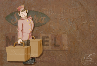
I felt like "playing" today with one of my sketches that I've had in my sketchbook for quite some time. I brought the bellhop pencil sketch into Photoshop for the digital coloring using the same technique I did for "Downward Dog". Once the bellhop was done, I put him into a composition using one of my own photographs, a couple of my textures, and a fun new font I found at dafont.com.
Font: Fontdinerdotcom Sparkly
Textures: Autumn Haze and an old paper texture I scanned in (if you want it ask me)
Photo: Vintage Sierra Motel Sign
Posted by Cindy Garber Iverson 0 comments
Labels: art, illustration
Monday, October 5, 2009
Behind the Scenes: The Beaded Chick
 The past couple of weeks, I've had the immense pleasure of doing a design job for Kimberly over at The Beaded Chick. She contacted me after seeing my work at the Rosehaven Cottage Digital Download Shop. She needed a custom-designed logo for her sterling silver and Swarovski crystal jewelry business and wondered if I could create one for her.
Since Kimberly and I live on separate coasts of the U.S., all our communications were via email (and Flickr). Kimberly gave me a wonderful description of what her vision for the logo was. My job was to interpret it into a little chick that she would love. So the first thing I needed to do was some pencil sketching. This is the pencil sketch that I started out with... I scanned the pencil sketch into the computer and opened it in Adobe Illustrator CS3 to do the "inking" (back in school I really used pen and ink for this step). I use Illustrator because it will create a vector graphic that will resize to any size without losing quality (no pixelated and jagged edges). I like to used a brush set on "charcoal" at various stroke widths to get the art marker look I like.
After the initial pencil sketch, Kimberly communicated an additional piece of her vision--that the little chick would be wearing a ring and a bracelet. So with those additions, the finished "inking" ended up looking like this... Then it was time to add some color. At this point, I switched over to Adobe Photoshop CS3 and placed the image into a Photoshop document (Illustrator files are compatible with Photoshop). Then I started creating layer after layer of color by "drawing" the color on using my digital tablet and a stylus. Every time I changed colors, I made a new layer (in case I wanted to make any adjustments along the way). The "inking" layer always stayed as the top layer over the colors. Doing this part is always a lot of fun and feels like coloring in a coloring book to me.
When I was done, I had this...
Once I had the little chick completed, I was also able to design Kimberly's blog header for her. Kimberly hadn't settled on any font type yet, so I hunted around over at dafont.com to find a free font that would convey a jeweled or beaded quality. I found Razzle Dazzle and knew it was the perfect fit! I already had MA Sexy for the pretty hot pink cursive writing. Using Kimberly's blog template as a color guide, I built the header to match her beautiful color palette. And this is what the finished header looks like...
Hubby loves the little "Beaded Chick". And I have to humbly admit that I do too and it's all because of Kimberly vision. Thank you, Kimberly, for this wonderful opportunity to create her for you! I am excited to see her write about her own creative journey on "The Beaded Chick" blog.
Posted by Cindy Garber Iverson 2 comments
Labels: behind the scenes, jewelry
IMPORTANT "PEARLY" NOTE: If you are using Internet Explorer, you aren't having the most beautiful "pearly" experience that you could have if you were viewing this site with Mozilla Firefox for the PC or Firefox for the Mac which is available for FREE download at the above links.
