Click on any of the images in this post to view larger
For this week's "Behind the Scenes" post, I thought it would be fun to share with you how I create an illustration piece from start to finish.
I did a rough sketch of a little dog on the back of some scratch paper when I was sitting in a meeting (it keeps me focused). I sketched it with the ballpoint pen that I had with me and didn't worry about the scratchy sketch lines that always happen when I sketch. I wanted the dog to be in a stretching "play with me" pose so I roughed out the basic shapes of its body lightly and then sketched in the details over the top with heavier strokes. If I make a mistake, I don't worry about it. Afterall, it's a sketch.
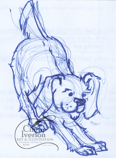
This sketch sat on one of my idea boards for months. My "idea boards" are a white board and a bulletin board I have behind my computer workspace with lots of sketches, clippings and ideas on them. That's where it sat until I had the inspiration to move on further with it.
Once I was in the mood to start playing with it more, I scanned it on my flatbed scanner so I had it in my computer as a TIFF file. Then I opened the TIFF file in Photoshop and started cleaning it up. For clean-up work, I use a Wacom digital tablet and digital pen on the eraser setting with a crisp edged brush at various diameters. I liked some of the sketchy lines, so I was careful to not erase those.
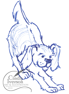 After the little dog was cleaned up to my satisfaction, I opened another Photoshop file and placed the cleaned up sketch as one layer and a scan of an old page of a book as another layer. To change the color of the blue ballpoint sketch, I went into "Curves" to adjust the RGB levels on the sketch layer and tweaked them until the sketch lines were a warm brown. I just eyeball it as I go and don't worry about specific numbers. Then I made the sketch layer a "Linear Burn" over the old page layer to make them more cohesive like I'd sketched the dog on the old paper.
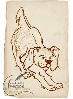
The coloring part was next and that's always fun. I used my Wacom tablet and digital pen again. I almost always set my brush to 20% opacity or less so I can get a washy effect similar to art markers or watercolors. Everytime I changed colors, I made a new layer so I can always go back and remove a layer I don't like without destroying the rest of my work.
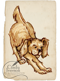
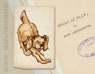
Once the illustration is all colored, it's done! Then I can take it and put it into composition like the one below. To make the composition below, I scanned the inside of an old library book that happened to have a fun title that worked with the illustration. I placed that scan as one layer and then placed the dog as another layer. I added a drop shadow on the dog layer to accent it. Then I added a text layer with the "Downward Dog" text down the left-hand side and reduced the opacity so it wouldn't distract the eye from the illustration of the dog.





2 comments:
Cindy, as usual, I am in awe of you...
Cindy, thank you for taking me through all these steps. I always enjoy that "how-to" information. Very cute little doggie... almost a Buddi-dog.
Post a Comment