


After finishing up the design work on the Dear Abigail Girl for DearAbigail.net, Abby wanted me to come up with an excited dancing version of our little gal. She wanted to pair the art with one of her favorite Marilyn Monroe quotes so she could use it as a Facebook button.
Here's the exciting news...
Abby wants this art to be available to anyone that wants to buy it for only $0.99 at the Rosehaven Cottage Digital Download Shop (click here to download it). It is also available without the DearAbigail.net lettering at the bottom (click here to download that version).
I can also add custom lettering to the bottom if you drop me a note at dustinginpearls at yahoo dot com with a special request--and it will still cost only $0.99.
Showing posts with label illustration. Show all posts
Showing posts with label illustration. Show all posts
Thursday, December 3, 2009
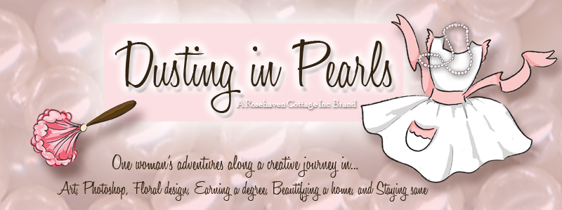
Dancing Dear Abigail Girl
Friday, November 20, 2009
Dear Abigail Girl

Over the past few weeks, I've had the privilege of working with Abigail at Dear Abigail to design and illustrate the "Dear Abigail Girl" to appear on a sidebar button on Abigail's newly burgeoning website for girls. Abigail had a great vision and articulated it so clearly. She wanted a curly-haired girl playing dress-up in colors that coordinated with her website's color palette. Because Abigail's website looks like a bulletin board, she wanted the illustration to look like it was taped up to the "bulletin board". So I was able to create that for her too. The Dear Abigail Girl is now being incorporated into the website by Abigail's coders and should make her debut soon.
Click here to visit Dear Abigail
Friday, October 9, 2009
Behind the Scenes: Constance

I've had a sketch in my sketchbook for quite some time (I called her "Constance") but have been stumped as to how to finish the dress.
As I was playing with some textures yesterday, I ran across one that is the scan of the outside of a beautiful antique botanical print portfolio. I named the texture "Library Paisley". Then I started playing with it to see if I could get it to change colors, and my experiments worked! I got a great red version that I called "Library Paisley--Red" (along with some other cool color versions like peacock, violet blue, and kelly green.
Today, it dawned on me that it was the perfect pattern I had been waiting for to use as the dress for my "Constance". I cleaned up the line drawing and elongated her legs in the process. Then I used the "linear burn" method that I wrote about in the "Downward Dog" post.
To apply the pattern to her dress, I used the masking technique in Photoshop straight from my copy of Photoshop CS3 Classroom in a Book (I couldn't have done it without my book because for some reason I have a mental block when using masks and it isn't intuitive for me). The cool thing about using a mask layer is that I can change the dress to be any other pattern I want with just a few clicks.
Then I set my brush on "Watercolor Heavy Pigments" and went to work adding color to the drawing that would coordinate with the dress.
Finally, I put the fully colored "Constance" onto a background of a scanned piece of old sheet music with the opacity dialed way down. I added type with the font Jellyka Saint Andrew's Queen (free at dafont.com) and skewed it to make it look like an autographed "photo".
Here is the final art (click on the image to view larger):
Wednesday, October 7, 2009
Bellhop
Click on image to view larger

I felt like "playing" today with one of my sketches that I've had in my sketchbook for quite some time. I brought the bellhop pencil sketch into Photoshop for the digital coloring using the same technique I did for "Downward Dog". Once the bellhop was done, I put him into a composition using one of my own photographs, a couple of my textures, and a fun new font I found at dafont.com.
Font: Fontdinerdotcom Sparkly
Textures: Autumn Haze and an old paper texture I scanned in (if you want it ask me)
Photo: Vintage Sierra Motel Sign
Thursday, September 10, 2009
Behind the Scenes: Downward Dog
Click on any of the images in this post to view larger
For this week's "Behind the Scenes" post, I thought it would be fun to share with you how I create an illustration piece from start to finish.
I did a rough sketch of a little dog on the back of some scratch paper when I was sitting in a meeting (it keeps me focused). I sketched it with the ballpoint pen that I had with me and didn't worry about the scratchy sketch lines that always happen when I sketch. I wanted the dog to be in a stretching "play with me" pose so I roughed out the basic shapes of its body lightly and then sketched in the details over the top with heavier strokes. If I make a mistake, I don't worry about it. Afterall, it's a sketch.

This sketch sat on one of my idea boards for months. My "idea boards" are a white board and a bulletin board I have behind my computer workspace with lots of sketches, clippings and ideas on them. That's where it sat until I had the inspiration to move on further with it.
Once I was in the mood to start playing with it more, I scanned it on my flatbed scanner so I had it in my computer as a TIFF file. Then I opened the TIFF file in Photoshop and started cleaning it up. For clean-up work, I use a Wacom digital tablet and digital pen on the eraser setting with a crisp edged brush at various diameters. I liked some of the sketchy lines, so I was careful to not erase those.
 After the little dog was cleaned up to my satisfaction, I opened another Photoshop file and placed the cleaned up sketch as one layer and a scan of an old page of a book as another layer. To change the color of the blue ballpoint sketch, I went into "Curves" to adjust the RGB levels on the sketch layer and tweaked them until the sketch lines were a warm brown. I just eyeball it as I go and don't worry about specific numbers. Then I made the sketch layer a "Linear Burn" over the old page layer to make them more cohesive like I'd sketched the dog on the old paper.
The coloring part was next and that's always fun. I used my Wacom tablet and digital pen again. I almost always set my brush to 20% opacity or less so I can get a washy effect similar to art markers or watercolors. Everytime I changed colors, I made a new layer so I can always go back and remove a layer I don't like without destroying the rest of my work.

Once the illustration is all colored, it's done! Then I can take it and put it into composition like the one below. To make the composition below, I scanned the inside of an old library book that happened to have a fun title that worked with the illustration. I placed that scan as one layer and then placed the dog as another layer. I added a drop shadow on the dog layer to accent it. Then I added a text layer with the "Downward Dog" text down the left-hand side and reduced the opacity so it wouldn't distract the eye from the illustration of the dog.


Subscribe to:
Comments (Atom)


